What Is A Media Query?
You may find that you have a component that works brilliantly on desktop but on mobile it doesn’t look quite how you’d like. With more and more people browsing on mobile devices its super important that we don’t neglect their design.
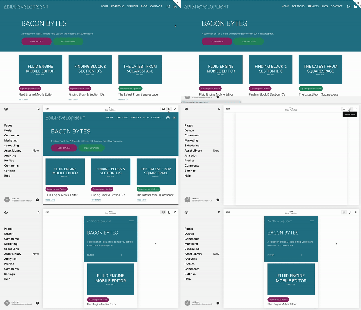
We can adjust the order & size of blocks in the mobile editor, however, it would also be excellent if Squarespace had built-in functionality of hiding certain blocks on mobile / desktop but this isn’t yet a feature. This is something we can achieve with a little bit of CSS Media Queries.
What is a breakpoint?
A breakpoint is a point where Squarespace changes the display of the blocks / elements to better suit a certain screen size. For example, the Mobile breakpoint is 676px.
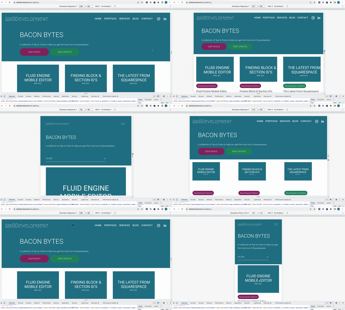
If you open the web inspector and resize your screen you’ll be able to see at which points this happens. The Web Inspector also has preset screen sizes you can look at along with a button to switch the orientation of the devcice.
Media Queries
We can use Media Queries to target specific screen sizes.
All of the code within the below Media Query would only target screens of 677px and above.
@media only screen and (min-width: 677px) {

}
All of the code within the Media Query below would only target screens of 676px and below.
@media only screen and (max-width: 676px) {

}
You’ll notice what one media query used 676px and the other used 677px, this is so that you don’t have both elements on the screen at the same time, or neither of them, even if its only at that one very specific screen size.
Hiding Blocks
In this example we’re going to hide the two buttons below on mobile and then show the accordion only on smaller devices in replacement.
I used the web inspector to work out at what breakpoint I wanted this change to take place, and then used the Squarespace ID Finder chrome extension to target the correct block.
// Hide Accordion on Desktop
@media only screen and (min-width: 776px){
  #block-yui_3_17_2_1_1681210343775_15261 {
    display: none;
  }
}

// Hide Buttons on Mobile
@media only screen and (max-width: 776px) {
  #block-yui_3_17_2_1_1681207743731_4160, #block-081ae22d48cb18070ae9 {
    display: none;
  }
}


